
Wednesday, 31 January 2018

Monday, 29 January 2018


Friday, 5 January 2018
Deconstruction of Horror Film Poster 2.
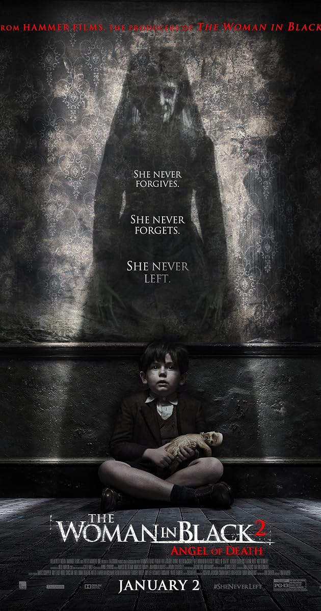
The movie poster contains standard poster features such as a picture, credit block, release date and the producer/director's name.
The main colours are red, white, black and brown. These colours are very dull and boring as-well as scary. The colours present and reflect the film genre, as they're very bold and dark which could connote the film to being a horror.
The genre's conventions in this poster are the dark and ''eerie' colours that clearly show this movie to be horror. Also the colours and themes of red, black and mostly white play an impact on this. The colour red is usually associated with blood, the colour black can symbolize death or pain, and ghosts typically are known and associated with the colour white. The teddy that the young boy is holding could also be another typical convention of horror films/paranormal effects, as items like this could be seen as possessed or artifacts of hell.
The poster reveals the release date, emphasising and building hype around that period of time creating tension and giving the target audience a burst of adrenaline as they're in excitement to watch the film after release, as-well as creating tension through small phrases such as ''she never forgives'', ''she never forgets'' and ''she never left''.
The main colours are red, white, black and brown. These colours are very dull and boring as-well as scary. The colours present and reflect the film genre, as they're very bold and dark which could connote the film to being a horror.
The poster reveals the release date, emphasising and building hype around that period of time creating tension and giving the target audience a burst of adrenaline as they're in excitement to watch the film after release, as-well as creating tension through small phrases such as ''she never forgives'', ''she never forgets'' and ''she never left''.
The symbols used are the figure/shadow that is standing tall behind the young boy. The figure stands out on the poster because it is presented as a bright/bold figure standing out as the key piece of information on this poster. Another key piece of information the poster offers is the little boy's teddy, the teddy seems to be destroyed or ruined, which could connote numbers of things giving slightly more information about the entire story. Lasty the by who is represented as a small child, although the way the poster has been designed could give the impression that he is being haunted by the demon or that he represents some form of evil himself.
The targeted audience are adults/teenagers ages 15+, from the cover of this poster I can identify that the poster is aimed towards this age group or aimed somewhat toward that age group, as well as focused more towards males as horror is more so viewed by the male gender however females do often view horror films as-well.
Wednesday, 13 December 2017
Deconstruction of Horror Film poster 1.
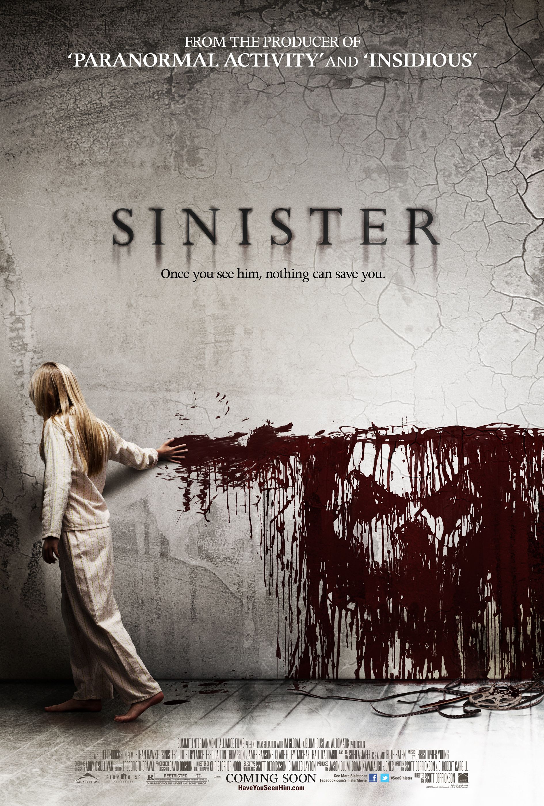
The film poster I am deconstructing is Sinister, my reasoning to this is because instantly I thought that I could write quite a lot regarding this poster, as well as being intrigued by what seems to be the protagonist in the bottom right hand corner.
To begin instantly I can see that the protagonist of the film is on the poster interlinking with the small yet powerful tagline under the title ''Once you see him nothing can save you''. This is a really deep and indulging tagline/image building lots of mystery around the character and questioning why he will take a life when you ''see'' him/her. The image of this monster covered in blood looks to be staring directly at the camera as if he is watching you.The theme of this is carried out in during multiple posters of sinister as well as this one as it forces it to seem like it is impossible to get away or escape him.
At the top of the page it identifies who the creator of the film is, this could mean that people may want to watch ''sinister'' for that reason as they enjoyed both ''paranormal activity'' and ''insidious'' previously. This gives a better advantage for trying to market the film as it has been produced/created by someone with good quality.
The title appears to be smudged but still easily readable, trying to create an eerie approach to the poster, giving emphasis toward the name, also possibly creating a mystery for why it may be like this. As said earlier the tagline beneath the title ''once you see him, nothing can save you''. tells me roughly what the story line. may be about, and what potential outcomes the film will have.
The colour scheme that is used, represents normal horror poster conventions as they usually consist of mostly dull, grey, black and white colours. The colors usually connote a sense of isolation, death, depression, bad thoughts, dread and possession all of these usually occur within the horror genre.
At the top of the page it identifies who the creator of the film is, this could mean that people may want to watch ''sinister'' for that reason as they enjoyed both ''paranormal activity'' and ''insidious'' previously. This gives a better advantage for trying to market the film as it has been produced/created by someone with good quality.
The title appears to be smudged but still easily readable, trying to create an eerie approach to the poster, giving emphasis toward the name, also possibly creating a mystery for why it may be like this. As said earlier the tagline beneath the title ''once you see him, nothing can save you''. tells me roughly what the story line. may be about, and what potential outcomes the film will have.
The colour scheme that is used, represents normal horror poster conventions as they usually consist of mostly dull, grey, black and white colours. The colors usually connote a sense of isolation, death, depression, bad thoughts, dread and possession all of these usually occur within the horror genre.
What resources can I take from this deconstruction?
From the ''Sinister Film Poster'' The one thing that stands out to me is the colour scheme, which edges to the theme of film giving an outcome of a spooky character haunting people. However every effect used for this poster has a purpose and plays a big part in announcing that it ids of the horror genre and is well produced.
Monday, 11 December 2017
Ancillary Task 3 Plan
A poster for my film trailer
Plan

Plan

This is the photo I will be using in create my film trailer poster, my biggest reason for choosing this photo is the fact that is includes everything I wanted, with the building of Appledurcombe in the background, a clear shot of the main character in the foreground, who appears to be looking at something creating a mysterious approach and enough room between the two, shown what the environment/grounds look like. Also there is lots of room for editing this picture, and I think i can create a good film poster.
The title is going to be above Jacks head, called APPULDURCOMBE, in big bold letters. Text i will use is called AWAKENING from www.dafont.com
I will include the actors name on the screen somewhere in bold capital letters, emphasizing who plays the role.
Taglines will play a big part in building suspense to the poster, one of which I will use along to the top of the page saying, '' a TERRIFYING experience''.
A second tagline under/near the title would also be effective.
A release date.
Film poster credits.
Ancillary tasks for my project
A promotion package for a new film, to include a trailer, together with two of the following
three options:
• A website homepage for the film;
• A film magazine front cover, featuring the film;
• A poster for the film.
I will be addressing these 3 tasks as : task 1, task 2, and task 3
Task 1 being - A webpage for the film.
Task 2 being - A film magazine front cover, featuring the film.
Task 3 being - A poster for the film.
I have chosen to complete, both task 2 and task 3, due to previous experience with these subjects.
• A website homepage for the film;
• A film magazine front cover, featuring the film;
• A poster for the film.
I will be addressing these 3 tasks as : task 1, task 2, and task 3
Task 1 being - A webpage for the film.
Task 2 being - A film magazine front cover, featuring the film.
Task 3 being - A poster for the film.
I have chosen to complete, both task 2 and task 3, due to previous experience with these subjects.
Sunday, 10 December 2017
Subscribe to:
Posts (Atom)
Question 2
I decided to complete this question with my friend who I worked on my trailer with, therefore using the same video.

-
The Women In Black 2 Deconstruction. The movie poster contains standard poster features such as a picture, credit block, release ...
-
 A poster for my film trailer Plan This is the photo I will be using in create my film trailer poster, my biggest reason for choosin...

